Dave Langer founded Dave on Data, where he delivers training designed for any professional to develop data analysis skills. Over the years, Dave has trained thousands of professionals. Previously, Dave delivered insights that drove business strategy at Schedulicity, Data Science Dojo, and Microsoft. Follow Dave on LinkedIn.
Empowering Excel Analysts
Welcome to the third in a series of blog posts showing how AtScale empowers Microsoft Excel users to conduct powerful data analyses.
This blog series is specifically designed for professionals who use Excel. As such, the following principles will guide this blog series:
- The primary focus will be analyzing data using Excel PivotTables.
- Technical details not related to Microsoft Excel will be kept to a minimum.
- Helping Excel PivotTable users learn new features to assist with data analysis.
Throughout this blog series, I will use the term “Excel Analyst” to refer to any professional who analyzes data using Excel PivotTables.
In my experience, the population of Excel analysts is easily 100+ million professionals worldwide. The goal of this blog series is to help as many of these professionals as possible to achieve more. In this analysis, I use the AtScale Semantic Layer Platform to connect my Excel PivotTables to live cloud data to do high-performing, real-time analysis without any data extraction. Read on to learn how to use Excel PivotTables to perform distribution analysis with real-time data without any data extraction.
The Scenario So Far
For a complete description of the hypothetical scenario used in this blog series and for some data background, check out the Part 1 blog post.
In Part 2 of the series, you began analyzing the Average Order Value (AOV) key performance indicator (KPI) over the past few years.
Your analysis showed that AOV has steadily decreased across two product lines and that more recently introduced product lines have AOVs far lower than what was once enjoyed several years prior.
The director of e-commerce (your boss’s boss) has tasked you with analyzing the data and providing options for increasing Internet sales and AOV.
The next step in the analysis is to dive deeper into Internet sales behaviors over time.
Analyzing Behavior Over Time
Your previous analyses used line charts to visualize Internet sales and AOV over time. While line charts are fundamental analysis tools, they do not tell the whole story.
To develop a deeper understanding of behaviors over time, you need a visualization that shows how typical Internet sales have changed through the years.
The Typical Sales Amount
It is pervasive in business analytics to use the average to represent a typical value. The reason for this is simple – the average is intuitive to a broad audience.
However, the average isn’t the only calculation representing a typical value. A common situation where the average is not used is where the average can be misleading because the underlying data is skewed.
Your analysis will leverage another commonly used calculation for representing typical values – the median.
Introducing the Median
A median represents the middle of a collection of numbers (e.g., the Sales Amount measure from the AtScale data model).
The median is the value that splits the data in two – half the values are less than the median, and half the values are larger than the median.
Consider the following Sales Amount values:
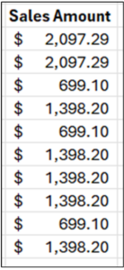
Fig 01 – Sample Sales Amounts
The first step in finding the median is to sort the data. The median is the value in the middle of the data.
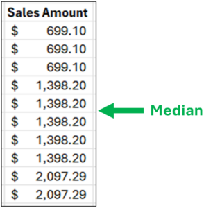
Fig 02 – Sorted Sample Sales Amounts
As illustrated in Fig 02, when there is an even number of numeric values (e.g., 10), the median is the average of the two values surrounding the middle of the data.
In this example, both values are $1,398.20, so the median is $1,398.20.
It’s interesting to compare the median to the average. With this sample data, the average is $1,328.29. In this example, the average and the median are reasonable choices to represent a typical value.
However, consider a slight change to the sample data.
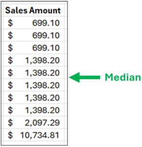
Fig 03 – A Slight Change to the Sample Data
The data in Fig 03 has only a single change – the highest Sales Amount is now $10,734.81.
Notice how the median remains unchanged. However, the average of these data is now $2,192.04 – which is 57% higher than the median!
Looking at the data of Fig 03, the median is a better choice for representing a typical value (i.e., eight out of ten values are closer to the median than the average).
While a contrived example, it does illustrate a common problem in business analytics – using the average by default without looking at the underlying data.
Here’s a real-world example of misusing the average– financial models (e.g., revenue projections) based on the average that are overly optimistic.
Characterizing the Range of Sales Amounts
As valuable as calculations like the average and median are for understanding numeric data, they only tell part of the story.
The other part of the story is understanding the range of values in numeric data. Analyzing the range of values answers many vital questions. Some examples:
- Are there many low values in the data?
- Are there many high values in the data?
- Are the values mostly the same?
- Are the values mostly bunched up in a narrow range in the middle?
The answers to the above questions describe the frequency distribution for a set of numeric data (e.g., a column of measurements).
We can expand upon the median \ to characterize how numeric data is distributed. Specifically, we can look at the “middle 50%” of the data.
Conceptually, this is quite intuitive. After calculating the median, you calculate the median of the lower and upper halves of the data.
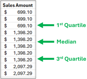
Fig 04 – Characterizing the Range of Sales Amounts
Fig 04 depicts these additional calculations using their technical names:
- The 1st quartile is the 25th percentile (i.e., 25% of the data is less than this number).
- The 3rd quartile is the 75th percentile (i.e., 75% of the data is less than this number).
Using the quartiles, the “middle 50%” of the data is everything between the 1st and 3rd quartiles.
Consider Fig 04. While the exact quartile calculations are a bit different (Excel handles the math), here’s how to think about the distribution of Sales Amounts conceptually:
- 25% of the data is below $699.10.
- 50% of the data ranges from $699.10 to $1,398.20.
- 25% of the data is above $1,398.20.
The combination of using the median for typical values and quartiles for the range of the values provides much more insight into the behavior of the Sales Amount measure.
Introducing the Box Plot
The box plot (or box and whisker plot) is a visualization that uses the median and quartiles to visualize the distribution of numeric data.
The box plot is handy as it allows for visualizing the distribution of numeric data by categories (e.g., product line, geography, and time).
The following subsections explain how to interpret box plots.
Interpreting the Box
Consider the following snippet from a box plot of Sales Amounts created using Excel.
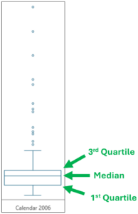
Fig 05 – An Excel Box Plot Snippet
First, note in Fig 05 that the category for the visualization is “Calendar 2006.” This box plot shows the distribution of Sales Amounts for the year 2006.
Fig 05 also depicts how the box is interpreted on a box plot:
- The top of the box represents the value greater than 75% of the data.
- The line within the box is the median (i.e., the 50th percentile).
- The bottom of the box represents the value greater than 25% of the data.
- The box height represents the “middle 50%” of the data.
Examining the box of Fig 05 shows that the median line is drawn toward the top, indicating some skew in the Sales Amounts.
Interpreting the Whiskers
After the box, the next aspect of box plots to examine is the “whiskers.”
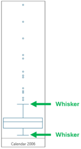
Fig 06 –Box Plot Whiskers
The length of box plot whiskers uses one of several standard calculations (for more details, see this Wikipedia article). For this blog post, the exact calculation isn’t necessary.
What is needed is an intuitive understanding of what the whiskers provide – a visual representation of how the lowest/highest values are distributed.
Using Fig 06 as an example, examining the whiskers shows that the lower whisker is shorter than the upper whisker.
This illustrates that higher Sales Amount values are more broadly distributed (i.e., the higher values are more spread out) than lower Sales Amount values.
Interpreting Outliers
The last aspect of box plots to examine is the outliers. Outliers are simply any values that are beyond the end of the whiskers.
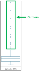
Fig 07 – Box Plot Outliers
One advantage of using box plots to analyze numeric data is using a standardized calculation for defining outliers.
Examining the outliers depicted in Fig 06 shows:
- There are no Sales Amount outliers below the bottom whisker. This means that the lowest Sales Amount values are not widely distributed.
- There are 13 Sales Amount outliers above the top whisker, which takes up much vertical space in the visualization. This means that the highest Sales Amounts are broadly distributed (e.g., there are a few very high Sales Amounts, and they vary widely).
With the knowledge of how to interpret box plots, it’s time to build a box plot of Sales Amounts over time.
Analyzing Sales Amounts
Configuring the Pivot Table
The AtScale data model built by your IT department has many features that make accessing the data needed to construct a box plot of Sales Amounts over time straightforward.
The first step is to add the Sales Amounts measure to the PivotTable.
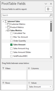
Fig 08 – Adding Sales Amount
Next is adding the Order Data Month Hierarchy dimension for the rows of the PivotTable.
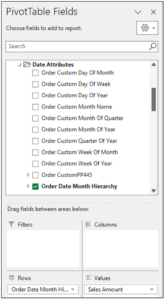
Fig 09 – Adding the Order Date Month Hierarchy
Adding the Order dimension to the rows of the PivotTable completes the initial configuration.
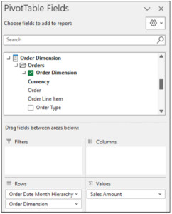
Fig 10 – Adding the Order Dimension
At this point, here’s what the PivotTable looks like.
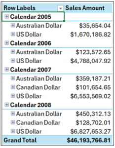
Fig 11 – The PivotTable So Far
As depicted in Fig 11, the PivotTable is not in the correct format for use in a box plot due to the hierarchical nesting of the data.
Converting the PivotTable to tabular form is the first step in correcting the format.
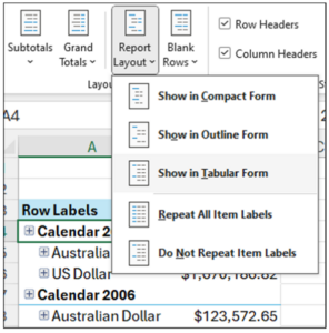
Fig 12 – Showing the PivotTable in Tabular Format
The menu item depicted in Fig 12 is accessed using these steps:
- With the PivotTable selected in the worksheet, click on Design in the Excel Ribbon.
- Click Report Layout.
- Select the Show in Tabular Form option.
The PivotTable will now look as follows.
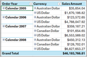
Fig 13 – The PivotTable in Tabular Form
The next step is to repeat the Order Year dimension values down the PivotTable.
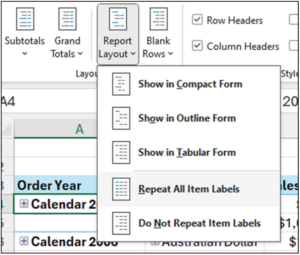
Fig 14 – Repeating PivotTable Item Labels
The menu item depicted in Fig 14 is accessed using these steps:
- With the PivotTable selected in the worksheet, click on Design in the Excel Ribbon.
- Click Report Layout.
- Select the Repeat All Item Labels option.
The PivotTable will now look like the following.
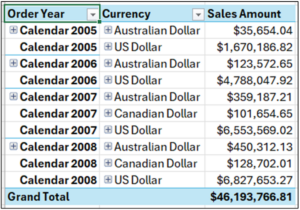
Fig 15 – The PivotTable So Far
While the PivotTable is configured correctly, the data is not usable for creating a box plot because the Order Dimension aggregates the data at too high a level.
Note: For brevity, this post will treat all currencies the same, even though this would be erroneous in the real world.
What is needed is to expand the Order dimension to the level of individual orders.
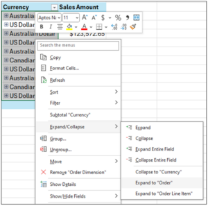
Fig 16 – Expanding the Order Dimension
Here’s how to expand the Order dimension:
- Select all the Currency cells.
- Right-click using your mouse.
- Select Expand/Collapse from the menu.
- Select the Expand to “Order” option.
Expanding the Order dimension produces fine-grained details from the AtScale data model your IT department created.
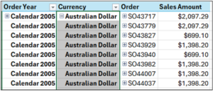
Fig 17 – PivotTable with Expanded Order Dimension
The PivotTable is now sufficiently configured to build a box plot using Excel.
Creating the Box Plot
When this blog post was written, Microsoft Excel did not support creating a box plot directly from a PivotTable.
The easiest solution is to copy and paste the PivotTable values to a new worksheet.
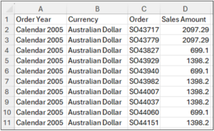
Fig 18 – Copying PivotTable Values to a New Worksheet
Note: Do not copy the Grand Total line of the PivotTable, as it is unnecessary.
The Currency and Order columns are unnecessary for the box plot, so it’s best to delete them.
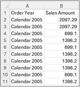
Fig 19 – Data with Currency and Order Removed
Selecting all the copied data from the new worksheet is the first step for creating the box plot.
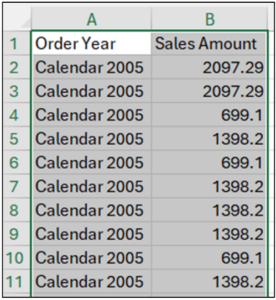
Fig 20 – Selecting the Data
With all the data selected, follow these steps:
- Select Insert from the Excel Ribbon.
- Within the Charts section, click on the Histogram option.
- Select Box and Whisker.
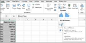
Fig 21 – Inserting the Box Plot
The box plot will be rendered within the worksheet.
Sales Amounts Analysis
The following is a cleaned-up box plot produced by the worksheet data.
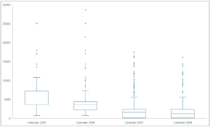
Fig 22 – The Box Plot of Sales Amount Over Time
Examining the box plot depicted in Fig 22 shows the following:
- In 2005, Sales Amounts varied far more than in recent years.
- In 2005, the median of Sales Amounts had the same value as the 25th percentile (that’s why no median line was shown), indicating that Sales Amounts were far more consistent at the low end compared to recent years.
- The median value of Sales Amounts has decreased every year.
- The boxes for 2007/2008 appear nearly identical, indicating many low Sales Amounts.
- There are many Sales Amount outliers starting in 2006 and continuing through 2008.
- The top whiskers for 2007/2008 are nearly identical, indicating that there are consistently high Sales Amounts, although not many.
- There are many Sales Amount outliers starting in 2006 and continuing through 2008.
What’s Next?
Examining Sales Amount behavior over time has built upon the understanding gained from previous analyses.


SHARE
Case Study: Vodafone Portugal Modernizes Data Analytics