Effective data storytelling is essential for turning insights into impact. But how do you craft a story that truly drives action?
Developing an analytics-driven culture is a gradual process that is strengthened over time through purposeful and effective data storytelling..
Implementing a new AI project or data model isn’t enough to motivate entire teams or organizations to actually use and derive value from data insights and analytics. However, framing data within a resonant narrative arc — with characters, a setting, a conflict, and a resolution — can inspire teams to make the most out of analytics applications.
This post outlines why data storytelling matters for building an analytics-driven culture, then walks through the four essential elements that make any data story compelling.
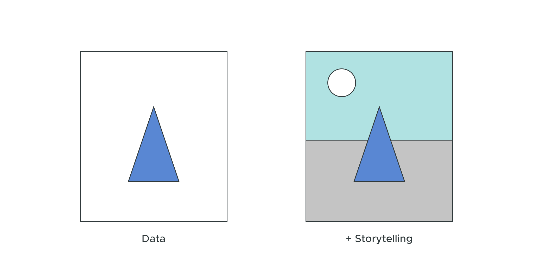
Take solid data, wrap it in a clear story, and bring it to life with great visuals. Suddenly, your insights don’t just sit there — they inspire people to act. That’s the power of data storytelling.
What Is a Data Story?
A data story is a structured narrative that uses data as evidence. It communicates insights, deepens understanding, and most of all, inspires action. Raw data or static reports? Those just sit there. A data story provides context, meaning, and direction, and guides audiences from observation all the way to decision.
What is Data Storytelling?
Data storytelling combines visual and verbal techniques to present data as a compelling storyline. This approach explains the context behind your data, highlights key insights, and can offer implications and recommendations to drive action.
The purpose of data storytelling is to improve how people understand and recognize insights from data. It provides essential context, highlights what matters most, and can guide the audience toward specific conclusions or actions. The key is to combine data with a clear storyline, impactful visuals, and, when appropriate, voice narration, video, or animation to bring your insights to life.
Businesses illuminate the potential value of data insights through storytelling, demonstrating why it’s worthwhile to learn new applications or adjust workflows to capture that value. This narrative approach gives analysis its meaning, helping insights lead to action. You’re not just showing numbers — you’re connecting them in a story that reveals what happened, why it matters, and what should come next.
The Importance of Crafting a Good Data Story
Most organizations have no shortage of data analytics capabilities, but few are using these data insights to their full potential. Why? Bringing data insights and analytics across the finish line takes work — people need to extract these data insights, apply them to a defined use case, and take the right action to create business value.
But getting there requires changes to people’s daily workflows, which can be challenging.
Numbers and hard facts don’t move people — emotions do. Data storytelling transforms a BI tool’s output of raw numbers and hard facts into an emotionally-focused, persuasive argument that’s more likely to inspire action than just a figure on a dashboard.
Why modern organizations use effective data storytelling:
- Makes data understandable: Translates technical insights into language that non-technical stakeholders can easily grasp.
- Fosters shared understanding: Creates a common language across teams and functions.
- Drives data-driven culture: Empowers confident, informed decisions at every level.
- Accelerates decision-making: Cuts through complexity to surface what truly matters.
- Builds trust in data: Provides transparency into how conclusions were reached.
Even the most sophisticated analysis can fail to inspire action without storytelling. Data storytelling bridges the gap between insight and impact.
Without addressing data’s role in time and place across use case narratives, data storytelling can seem like a peripheral soft skill in theory. In practice, it’s a necessary tool for achieving business impact.
Core Elements of Effective Data Storytelling
You know a good story when you hear one. That’s because compelling stories, no matter if it’s about how and why close rates doubled or a girl in a red hoodie taking a forbidden shortcut in the woods, all contain the same four elements: characters, setting, conflict, and resolution.
Data storytelling requires those same narrative factors, plus reliable data, visualizations, and an audience-centric approach.
Let’s start with the four essential elements for a good narrative arc.
1. Characters: Who are the Stakeholders?
The first element analysts and business leaders need to consider is character: who does this data affect? Who should the audience relate to? Every good story centers on a character that the audience can see themselves in.
Build a character profile that mirrors your audience. If you’re speaking to engineers, the data story should revolve around someone developing an app or software solution with the same KPIs as your audience. Make it clear how and why the data insights will impact their role, their performance, or their project.
This impact needs to be significant, or it won’t be moving. Fill out the details of the character and their goal thoroughly enough that the audience can see the big picture. Talk about what’s important to this character, why they’re invested in the project they’re working on, and how success or failure would make them feel. This emotional portrait is the engine that will drive your story forward.
2. Setting: What is the context?
Next, you need to ground your audience in a specific time, place, and environment. Explain why your protagonists must achieve their goals at this time and in this situation. Identify the inflection point that elevates this scenario to one of significance.
Outline a before, during, and after to answer the following questions:
- What happened before implementing this data model?
- Why did the character start using the analytics capabilities they’re using now?
- What will happen if this character effectively leverages these data insights?
- What will happen if they don’t?
Again, ensuring the setting and context of this story are relatable to your audience is essential. They should optimally be working at an organization similar to that of your character, during a time that is typically stressful or significant for the business, working on a project that carries some weight in relation to the character or the organization’s KPIs.
3. Conflict: What is the Problem?
Within this context, you need to create a point of tension. This serves as the conflict, or problem, of your story.
The stakes need to be high enough that the audience feels some kind of emotional investment in this problem being solved. At the same time, the conflict needs to be one that either has happened or could happen in the work lives of your own audience. Otherwise, the story won’t resonate with listeners.
This conflict needs to have only one pertinent solution: the data insights generated from the AI project or data model your team uses. Solving this problem through the application of data insights must result in some measurable reward for the characters.
4. Resolution: What is the Proposed Solution?
Finally, neatly wrap up your story with a satisfying ending. This is where you should prominently feature data insights as the solution to the protagonists’ problem.
The solution to the problem must feel inevitable and meaningful. Outline how the characters solved the problem in detail, what occurred as a result of this problem being solved, and what the entire organization gained as a result of this solution.
This part of your data story should include a reference to the bigger picture. If your audience zooms out, do they see a larger value in solving this problem through data, either on a personal or professional level?
It’s also important to discuss what the audience can learn from this story. Talk about how leveraging data insights could provide similar value moving forward, and how the organization can measure the success of their efforts to integrate actionable data insights into their workflow.
This will make it clear to your audience what they should do with data insights, how leveraging data insights will impact their professional goals, and the business at large.
Now, let’s add three elements that are specific to great data storytelling.
1. Reliable Data
Your story’s strength depends entirely on the data behind it. Trustworthy, relevant, and well-governed data form the foundation of any compelling data story. This means:
- Using accurate, validated data sources.
- Ensuring data quality and consistency.
- Applying appropriate analytical methods.
- Being transparent about data limitations.
Poor data quality comes at a high price, about $13 million in annual losses for the average organization. That’s why your audience needs confidence that your insights are built on solid, reliable information. A semantic layer like AtScale ensures that everyone works from a single source of truth, eliminating inconsistencies and building confidence in the shared insights.
2. Visualizations
Visual elements transform abstract numbers into intuitive, memorable insights. Effective visualizations:
- Simplify complex information
- Highlight patterns and trends
- Support the narrative (not distract from it)
- Are accessible to your audience’s level of data literacy
What might take paragraphs to explain can be communicated in seconds by the right chart or graph. Visualizations should always serve your narrative, making it easier for audiences to grasp key insights at a glance.
3. Audience-Centric Approach
The most effective data stories are tailored to the audience. Ask yourself:
- What does your audience already know?
- What decisions need to be made by them?
- What level of detail do they need?
- What objections or questions might arise?
A data story for executives should focus on business impact, while one for analysts should emphasize methodology and nuance. Ultimately, compelling data storytelling strengthens organizational data literacy—the ability to understand and apply data to create business value. This foundation ensures that AI initiatives and new data models deliver measurable ROI.
The Roadblocks to Creating Data Stories
Crafting a narrative is only one piece of the puzzle when it comes to telling a compelling data story. The other challenges revolve around actually extracting meaningful data insights from data models or analytics systems.
Getting the Right Data from Disparate Systems
Most organizations use multiple data sources and analytics applications to uncover insights. While this variety provides richer, more granular perspectives, it also introduces complexity. When data from different systems must be manually combined into a single, holistic view, it creates extra work across teams — and often discourages people from turning insights into action.
Duplication of Effort When Computing Business Metrics
Disparate systems not only complicate workflows but also lead to redundant work. Teams often find themselves repeating the same analyses without generating additional value. Reducing duplication is essential to keeping teams motivated to use analytics platforms and data models — and to preventing burnout.
Inconsistent Insights from Siloed Data Sources
Relying on multiple systems and data models often results in conflicting information from different sources. These inconsistencies can confuse or mislead end users and erode confidence in analytics. Without a single source of truth, teams struggle to know which insights to trust, weakening decision-making across the organization.
How to Tell a Compelling Data Story
This step-by-step approach can be followed to craft data stories that drive results:
1. Define Your Purpose
Start by asking: What decision am I trying to drive? Your story should have a clear objective — whether it’s securing budget, changing a process, or highlighting an opportunity.
2. Identify Your Audience and Their Expectations
You need to understand who you’re speaking to and what matters to them. Executives care about business impact; operations teams need actionable insights; analysts want methodological rigor.
3. Select Reliable Data and a Storytelling Structure
Use data that directly supports your narrative. Organize your story using a clear structure — situation, complication, resolution, or problem-insight-action.
4. Choose Purposeful Visuals
Select charts and graphs that illuminate your point without overwhelming your audience. Every visual should have a clear purpose tied to your narrative.
5. Add Context and Anchoring Insights
Don’t assume your audience sees what you see. Provide context to help them understand:
- Why this data matters now.
- How it compares to benchmarks or expectations.
- External factors that might be influencing the results.
6. End with Actionable Recommendations
Every data story should end with clarity about next steps. What should your audience do with this information? Be specific and practical.
AI and Data Storytelling
AI is changing the way organizations build and share data stories. With AI-driven analytics platforms, data storytelling is becoming easier, faster, and more powerful than ever — no matter the organization’s size.
How AI Enhances Data Storytelling
Automated Data Preparation and Analysis: AI can rapidly process and analyze massive datasets, identifying patterns, anomalies, and trends that might take humans days or weeks to uncover. This technological advancement fuels innovation and economic growth across industries by enhancing analytics and research capabilities.
Intelligent Visualization Suggestions: Modern AI tools recommend the most effective chart types and visual formats based on your data and intended message. This empowers non-experts to create professional, impactful visualizations without requiring deep design expertise.
Natural Language Generation: AI can automatically generate narrative summaries of data trends, translating complex statistical findings into clear, plain-language insights. This capability is especially useful for creating executive summaries or early drafts of data stories.
Democratized Access to Insights: AI-powered analytics platforms lower the technical barriers to data storytelling. Business users without advanced analytics skills can now explore data, generate insights, and craft compelling narratives on their own.
Predictive and Prescriptive Insights: AI helps storytellers go beyond describing what happened — it explains why it happened and what’s likely to happen next. By adding predictive and prescriptive layers to data narratives, organizations can enable more proactive and informed decision-making.
The Human Element Remains Essential
AI can speed up and enhance data storytelling, but it can’t replace human judgment. Sure, conversational AI is great for answering simple questions — but when it comes to complex decisions, you still need the clarity and depth that come from visual data stories and interactive dashboards.
What AI can’t do:
- Grasp your organization’s full context or internal dynamics.
- Know which insights will truly resonate with different audiences.
- Make ethical choices about how data should be presented.
- Tell stories that reflect your company’s values and priorities.
- Build the trust and relationships that make stories stick.
The real magic happens when you combine AI’s analytical power with human creativity, empathy, and perspective. Let AI take care of the data crunching and early analysis, then use your human insight to shape narratives that connect, inspire, and drive real action.
Advanced Elements: Beyond the Basics
To elevate your data storytelling, consider these advanced techniques:
1. Contextual Relevance
Tie your insights to real business outcomes. Show how the data connects to revenue, customer satisfaction, operational efficiency, or strategic goals, grounding abstract insights into a tangible impact.
2. Emotional or Intuitive Hooks
While data storytelling is analytical, it should also engage intuition and emotion. Use relatable examples, customer stories, or scenarios that help audiences connect personally with the insights.
3. Iterative Testing
Validate your story before the big presentation. Test visualizations and structure with a small audience. Gather feedback on clarity, persuasiveness, and areas of confusion. Refine accordingly.
4. Embedded Metrics or Feedback Loops
Track how your data stories perform over time. Are decisions being made? Are dashboards being used? Use this feedback to continuously improve the effectiveness of your storytelling.
Visualization Best Practices
Great visualizations follow consistent design principles.
- Keep Charts Simple and Purposeful: Every element should serve a purpose. Remove unnecessary gridlines, labels, or decorative features that don’t add meaning.
- Use Intuitive Visual Cues and Hierarchy: Guide the eye to what matters most. Use size, color, and position to establish visual hierarchy. Highlight the key insight you want viewers to notice first.
- Avoid Distractions and Clutter: Less is more. A simple, focused chart beats a complex dashboard that tries to show everything at once.
- Label Clearly, Prioritize Simplicity: Clearly label every axis, legend, and data point. Your audience shouldn’t have to work to understand what they’re looking at.
For dashboard-driven storytelling, create interactive narratives — using tools like Tableau, Power BI, or Looker — that let audiences explore data on their own terms. Use AtScale to ensure the underlying data remains consistent and trustworthy.
Audience and Context Tailoring
Depending on who’s listening, the same data story can and should be told differently:
For Executives
- Focus on business impact and ROI
- Use high-level visualizations
- Lead with recommendations
- Keep technical details minimal
For Operations Teams
- Show operational insights and trends
- Include actionable metrics
- Provide drill-down capabilities
- Connect data to daily workflows
For Analysts
- Explain methodology and assumptions
- Share data sources and transformations
- Include nuance and caveats
- Encourage questions and exploration
For General Audiences
- Prioritize clarity over technical depth
- Use analogies and relatable examples
- Avoid jargon
- Focus on the “so what?” rather than the “how?”
Tailoring your story to your audience isn’t about dumbing things down. It’s about respecting their time and making your insights accessible. Remember that different stakeholders have different priorities, levels of data literacy, and decision-making needs.
Also consider your audience’s roles, experience with data interpretation, and overall expectations that inform the most relevant types of language and data points. Understanding these differences and adapting your approach accordingly is what separates good data storytelling from great data storytelling.
Evaluate Story Impact
How do you know if your data story worked? Measure effectiveness through:
Engagement Metrics
- View time or dashboard usage
- Shares or forwards
- Adoption rates of new reports or dashboards
Understanding Metrics
- Qualitative feedback from audiences
- Follow-up questions that indicate comprehension
- The ability of audiences to explain the insights to others
Behavior Change Metrics
- Decisions made based on the story
- Actions taken or processes changed
- Business outcomes that improve as a result
The real test of any data story is whether it actually moves people to act. If you’re not tracking outcomes, you’re flying blind and missing opportunities to sharpen your analytics communication.
Set up regular check-ins with your stakeholders. Find out which stories clicked with them and which ones missed the mark. Ask what information gaps still exist. These conversations give you invaluable intel that formal metrics often miss.
Consider running simple surveys after presentations. Keep the questions straightforward: Was the story clear? Did the data help them make decisions? What would they change? You want honest reactions, not polite nods.
One effective technique is measuring knowledge transfer. Ask your audience to rate their understanding of the topic before your presentation, then ask again afterward. The gap tells you whether your story actually taught them something new.
But knowledge alone isn’t enough. Track what happens next. Did teams actually use your insights? Did behaviors change? Did the recommended actions get implemented? This follow-through data becomes your most valuable feedback.
This continuous loop of presenting, measuring, and refining keeps your data stories sharp and relevant. Each iteration teaches you something about your audience’s needs and how to meet them better. Over time, you’ll develop an instinct for what resonates and what gets results.
Data Storytelling: Key Takeaways
Data storytelling combines reliable data, narrative structure, and visuals to turn insights into action.
1. Stories drive action, not numbers. Raw data and dashboards don’t inspire change — emotional narratives do. When you wrap insights in a compelling story with characters, conflict, and resolution, you transform passive information into active decisions.
2. Trust starts with reliable data. Your story is only as strong as its foundation. Without accurate, consistent, and well-governed data, even the most compelling narrative falls apart. A single source of truth builds confidence across teams.
3. Match your message to your audience. Executives need business impact, analysts want methodology, and operations teams require actionable metrics. The same data tells different stories to different people — tailor accordingly.
4. Visuals clarify, not decorate. Every chart should have a purpose tied to your narrative. Simple, focused visualizations that highlight key patterns beat complex dashboards that try to show everything at once.
5. Context makes insights meaningful. Don’t just show what happened — explain why it matters now, how it compares to expectations, and what should happen next. Ground abstract data in real business outcomes.
6. Measure impact, not just engagement. A successful data story changes behavior. Track whether decisions get made, actions get taken, and outcomes improve — then use that feedback to sharpen your next story.
Elevate Your Insights with AtScale’s Semantic Layer
Great data stories start with data you can trust. AtScale’s semantic layer provides a consistent, governed foundation for all your analytics -— ensuring that every dashboard, report, and data story is built on accurate, reliable data.
With AtScale, your organization can:
- Ensure consistency across all tools and teams.
- Accelerate time to insight with pre-modeled metrics.
- Scale analytics without sacrificing performance.
- Empower more people to tell data stories with confidence.
Ready to transform how your organization tells stories with data? Learn more about AtScale’s semantic layer or request a demo today.
Frequently Asked Questions
The four narrative foundations: (1) Characters: stakeholders your audience can relate to, (2) Setting: the business context and timing, (3) Conflict: the problem or opportunity at stake, and (4) Resolution: how data insights solve the problem.
Plus three data-specific elements: (5) Reliable data: accurate, validated sources that form your story’s foundation, (6) Purposeful visualizations: charts and graphs that simplify complex information and support your narrative, and (7) An audience-centric approach: tailoring your message to match your stakeholders’ expertise, priorities, and decision-making needs.
Like any narrative, a data story should be structured: establish context and the question you’re answering at the start, present the data and analysis in the middle, and conclude with clear insights and actionable recommendations. Think of the structure as a character (who’s affected), in a setting (business context), with a conflict (the problem or opportunity), that gets resolved (what to do next).
Trustworthy data, a clear narrative arc, purposeful visualizations, and tailoring to the audience’s expertise and decision-making needs build effective data storytelling. It also includes context that helps audiences understand why the insights matter and ends with specific, actionable recommendations.
Keep your visualizations simple and purposeful, use intuitive visual cues to guide the eye, avoid clutter and distractions, label everything clearly, and ensure every chart serves the narrative. Choose the right chart type for your data (line charts for trends, bar charts for comparisons, etc.) and maintain visual consistency throughout your story.
Tailor your stories by understanding what each audience cares about. Focus on business impact and high-level insights for executives, provide actionable operational metrics for operations teams, include methodological details for analysts, and emphasize clarity and simplicity for general audiences. Adjust your level of technical detail, choice of visualizations, and emphasis on outcomes accordingly.
AI can automate data preparation, suggest relevant visualizations, identify patterns and anomalies, and even generate narrative summaries of data trends. AI-powered analytics platforms can help democratize data storytelling by making it easier for non-technical users to explore data and generate insights. However, human judgment remains essential for context, interpretation, and ensuring stories resonate with audiences.
SHARE
Guide: How to Choose a Semantic Layer